 (click for a larger image)
Despite the popularity of this kind of world map, it's only one of many possible ways of depicting the earth, its lands, and its various people. More importantly, in terms of accuracy and sociopolitcal equity, it's also a bad way of depicting the earth, and of imagining it, because it reflects and encourages Eurocentric, "white" notions of superiority and centrality.
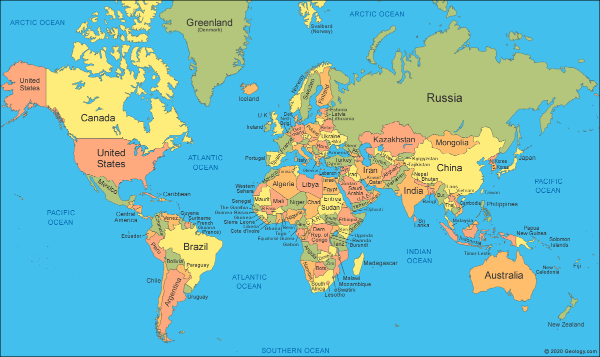
This popularly accepted image of the world is called a "Mercator projection," after Gerhardus Mercator, the Flemish mathematician and cartographer who invented it in 1569. In order to make it easier to navigate the globe, Mercator filled a rectangle with the surface of our spherical earth by shrinking some of its details and magnifying others. This distorted image comes to mind for most Americans as the way the world looks on a map because it's long appeared as the most common type of world map in textbooks, classrooms, and daily life.
In order to make the globe fill out a rectangle, Mercator enlarged land masses near the North and South Poles. A distortion commonly cited to illustrate this problem is the way the map portrays Greenland and Africa as about the same size. In the real world (or rather, on it), Africa is actually about fourteen times larger than Greenland. Also, since Europe and North America are distant from the equator, they too appear proportionally larger than they really are. A general problem with the Mercator projection's popularity occurs when many of us go on to confuse this distorted map for the territory.
Aside from fostering a distorted understanding of what the world really looks like, this map also reflects the location of its maker and users in Europe. It does so by placing this completely arbitrary geographical location directly in the center of the world (or almost directly--given Mercator's method, its location north of the Equator means that it has to be a bit north of dead center).
This manifestation of a European tendency to put themselves "at the center of things" brings to mind a famous New Yorker magazine cover, which depicts a map of America from a New Yorker's perspective:
 (click for a larger image)
This cover became a popular poster in the late 1970s, primarily because it effectively satirizes the ironic provincialism of arrogantly "cosmopolitan" New Yorkers. By depicting New York as so much larger and more detailed than the rest of the U.S., and other parts of the world, the artist suggested that New Yorkers have a way of assuming that their city is the center of the earth.
I'm sure that few if any New Yorkers literally do imagine the world this way, and the map on this New Yorker cover probably also struck many of them as funny, and yet in a way, accurate. But in terms of actually trying to represent the world in the form of a map, many groups of people have literally put their land at the center, implying in the process their own heightened significance. Perhaps its natural to do that. Again, though, the problem with the Mercator projection, and especially with its popularity, is that it embeds in people's minds a false and arrogant notion of European (and thus by extension, "white American") significance.
In his book Colored White: Transcending the Racial Past, David Roediger analyzes a reworking of the Mercator projection that was published in 1929 by a group of Surrealists. Roediger points out how this map uses absurdist hyperbole to lampoon the Mercator projection's Eurocentric bias, in part by shrinking Europe and eliminating some of its countries. He also notes that other cultures have produced ethnocentric world maps, such as "an ambitious map drawn by members of Chief Powhatan's confederacy" during the period of British colonization:
The map placed the land which the Native Americans inhabited at the center of a flat world. Near the map's edge, a small pile of sticks represented England. In the early 1720s, remarkable Chickasaw and Catawban maps came into the possession of British officials in Charleston, South Carolina. One Chickasaw map placed the "Chickasaw Nation" in Northern Mississippi at its center, and one produced by a member of a Catawban group enlarged the Piedmont dramatically.
So seeing one's group at the center of things is probably a common human tendency, and indeed, there's a word for it--ethnocentricism. However, this tendency becomes a problem when one group enforces its own ethnocentric version of things onto other groups, washing away and often blasting away their ways of being, in favor of the dominant group's "naturally" more "civilized" ways.
The problem with the Mercator projection, and with other maps that place Europe at the center, is that they foster the common American perception that Europeans, and especially their American descendants, are also at the center--socially, culturally, politically, lingusitically, aesthetically, and in many other ways.
Americans learn in school that the colonial powers of England, France, and Germany are long gone, but most American teachers and other adults don't like to acknowledge that their own country has long engaged in what amounts to imperial abuse. The encouragement in our classrooms of a seemingly common-sense notion of "American exceptionalism" helps our corporate-funded leaders justify America's long tradition of racist resource- and labor-grabbing practices abroad. The continued use of Eurocentric maps like the Mercator projection is just one way of instilling this artificial form of "common sense."
Surprisingly enough (to me at least), the writers and producers of a corporate product, the defunct TV show The West Wing, addressed the role played in this indoctrination process by distorted world maps; they even went as far as having characters explain the arrogant and dismissive implications of the Mercator's projection to a presidential aid, in the hopes that the president would demand its widespread replacement. And, they even discuss an actual, viable replacement, the Peters Projection (of which I've included an example below).
I haven't seen the full episode--have any of you? Unfortunately, the following three-minute clip suggests that it deploys the usual corporate-media tactic: dismissing radical dissent by presenting its representatives as scruffy weirdos. Thus, I doubt that the show's fictional president eventually decides to recommend widespread adoption of more accurate world maps.
It's been a long time since I was in school--I wonder how many teachers have replaced Eurocentric world maps with something more like the Peters Projection (a.k.a., the Peters Equal Area World Map)?
This map was created by Arno Peters, who caused quite a stir in cartographic and scholarly circles when he presented it at a press conference in 1974. Peters argued that although his map also distorts some parts of the world, its depiction of the world's countries in more realistic proportions to each other could encourage a more equitable sense, and thus treatment, of all the world's people.
In case you didn't catch the Peters Projection in that West Wing clip, here it is again:
 (click for more information)
Although Europe is still centralized on this map, its decreased size works against the Eurocentic bias of maps like the Mercator Projection. And "Eurocentrism" is the problem I'm basically writing against here.
The term "Eurocentrism" is sometimes used interchangeably with "whiteness," but I think their meanings differ. Both are grounded in a largely unexamined perspective that favors and calls upon European or "Western" "civilization," but "whiteness" has more to do with notions of race that are buttressed by Eurocentrism. And of course, European whiteness differs from American whiteness.
In their book Unthinking Eurocentrism, Ella Shohat and Robert Stam use the notion of "mapping" as a metaphor in their explanation of what Eurocentrism is, and why it's a problem. Their explanation makes this overly long blog entry even longer, but it's worth quoting at length, to flesh out the larger problem that Eurocentric maps are a part of:
Endemic in present-day thought and education, Eurocentrism is naturalized as "common sense." Philosophy and literature are assumed to be European philosophy and literature. The "best that is thought and written" is assumed to have been thought and written by Europeans. (By Europeans, we refer not only to Europe per se but also to the "neo-Europeans" of the Americas, Australia, and elsewhere.) History is assumed to be European history, everything else being reduced to what historian Hugh Trevor-Roper (in 1965!) patronizingly called the "unrewarding gyrations of barbarous tribes in picturesque but irrelevant corners of the globe."
Standard core courses in universities stress the history of "Western" civilization, with the more liberal universities insisting on token study of "other" civilizations. And even "Western" civilization is usually taught without reference to the central role of European colonialism within capitalist modernity. So embedded is Eurocentrism in everyday life, so pervasive, that it often goes unnoticed. The residual traces of centuries of axiomatic European domination inform the general culture, the everyday language, and the media, engendering a fictitious sense of the innate superiority of European-derived cultures and peoples. . . .
Europe is seen as the unique source of meaning, as the world's center of gravity, as ontological "reality" to the rest of the world's shadow. Eurocentric thinking attributes to the "West" an almost providential sense of historical destiny. Eurocentrism, like Renaissance perspectives in painting, envisions the world from a single privileged point. It maps the world in a cartography that centralizes and augments Europe while literally "belittling" Africa.
The "East" is divided into "Near," "Middle," and "Far," making Europe the arbiter of spatial evaluation, just as the establishment of Greenwich Mean Time produces England as the regulating center of temporal measurement. Eurocentrism bifurcates the world into the "West and the Rest" and organizes everyday language into binaristic hierarchies implicitly flattering to Europe: our "nations," their "tribes"; our "religions," their "superstitions"; our "culture," their "folklore"; our "art," their "artifacts"; our "demonstrations," their "riots"; our "defense," their "terrorism."
I'll end by emphasizing that the Eurocentric maps commonly used in American classrooms and textbooks are not the only ways our educational system instills and promotes Eurocentrism and/or white hegemony. In many fields, including history, literature, biology, psychology, sociology, anthropology and others, the basic, grounding fundamentals remain Eurocentric and white American.
These "European" fundamentals, which often remain unacknowledged and unexamined, include an academic area's presumptions and perspectives, its lauded figures and "heroes," its methods and practices, and in most cases, even the teachers themselves. Adding "mulitcultural" lessons, chapters, images, books and so on about and by non-white people can help broaden students' perspectives, but what does this add-on approach really do to identify and challenge the culturally and racially specific center?
If you have an American education, in what other ways was your schooling Eurocentric and/or white American?
Do you remember any teachers countering that central bias, perhaps by explaining the problems and effects of distorted maps like the Mercator projection, or in other ways?
And if you happen to be a teacher, are you doing anything in your classrooms to directly mark and challenge the whiteness buried at the heart and methods of your field?
[This post covers a lot of ground (so to speak), but in order to avoid losing readers, I've left a lot out. The differences between Eurocentrism and whiteness, for instance, call for further elaboration. I also wanted to cover the "North/South, Top/Bottom" problem--if that interests you, take a look at "The Upsidedown Map Page." Finally, I'm not a cartographer, so if I got something about maps wrong here, or anything else, please do correct me in a comment.]

>And of course, European whiteness differs from American whiteness.
ReplyDeletePlease elaborate on this.
jw, I'm more informed about American whiteness than European whiteness, but I would say that while both arise, especially, in contradistinction to perceived groups of non-white people, and to the supposed threat from them, they do so in different sociohistorical contexts, and in different relations to a perceived national context and identity. American whiteness came about in relation to a native population that was conquered by white people relatively recently, and by a population that was enslaved by whites rather recently. It also arises by bleaching away European "ethnicity," while European whiteness seems to retain a different sense of national identity, one that Americans would perceive as ethnic. Perhaps what Americans see as instances of European whiteness might be seen there as "French," or "German," or maybe "white French" or "white German."
ReplyDeleteWhat do you think? As a white German person who has expressed very strong opinions on whiteness/white supremacy, you must have something to say about how European whiteness differs from American whiteness . . . or maybe you don't think they are different?
Interesting post.
ReplyDeleteAmericans learn in school that the colonial powers of England, France, and Germany are long gone,
By "long gone", do you mean "long gone from the United States" instead of "long gone from the world"?
Why do we have to project the globe on to a 2D representation, anyway? People need to think of the earth as spherical instead of flat.
By "long gone", do you mean "long gone from the United States" instead of "long gone from the world"?
ReplyDeleteI mean that what they learn, in the cases of England and France, is "long gone" from both North America and the world, and in the case of Germany, if the topic gets covered at all, from the world. At least, this is what I remember from my schooling.
Why do we have to project the globe on to a 2D representation, anyway? People need to think of the earth as spherical instead of flat.
Maps are often more convenient than model globes. I also seriously doubt that learning from maps, and sometimes from globes, movies, and other 3D representations, prevents any children from learning and keeping in mind that the earth is spherical instead of flat.
>I'm more informed about American whiteness than European whiteness,
ReplyDeleteEurope is a continent, therefore I think it doesn't make much sense to talk about "European whiteness". This differs within countries, also because of different histories. Germany's racism is still very influenced by former Nazi-Germany and "Aryaness" or Germaness and who is considered German or not.
How about the fact that I know more about European whiteness than African blackness as a black girl in America? I learned practically nothing about the, Nubians, the Benin Empire, the Mali Empire, the Asnate, the Oyo Kingdom, the Kush of Ethiopia, but I learned a lot about the Romans, the Greeks, the Dark Ages, The Renaissance, The French Revolution, etc. in a supposed high school World History class rather than just a European history class with a little bit about Egypt, Ancient China, and the Mayans/Aztecs/Incas. Most of it was almost exclusively European history. The imbalance was kind of disturbing.
DeleteAs a black girl in America, I learned a whole lot about European history in my world history class like the Romans and the Dark ages/Renaissance and nothing about sub-saharan Africa like the Benin Empire or the Kush of Ethiopia for example. There is nothing wrong with teaching European history, but the fact that they continue to focus on Europe as the most important and consistently ignore the contributions of countries of POC (especially black people in Africa) is reinforcing perverse acts white supremacy in the educational system.
DeleteI well remember the West Wing episode with that map because, similar to the character's, my reaction was shock at how badly the Mercatur map distorts the world. The episode did start by showing the presenters as quirky but watching the entire episode made it clear that this was a completely legitimate subject.
ReplyDeleteWe have world maps in various parts of our house to help avoid geo-ignorance in our children. It's a "luxury" no United States citizen can afford in a global world. But we'll have to search hard for a Peters map. I expected to see many more of them after that West Wing episode.
Thanks for the details.
Macon D,
ReplyDeleteIf racism has arisen from the "supposed threat from them" (non-white people) then how do you explain the conflict between the Irish and the English? Or the alliance between Germany and Italy during WWII? While northern Italians are similar to Germans, southern Italians wouldn't even be considered white by many supremacists, right?
What do you think of the French Resistance?
What's your opinion of the recent murder of Vincent Van Gogh's grandson over an anti-Muslim movie he made?
Your comment in reply to jw sounded so unclear to me, I couldn't figure out what you were trying to say.
This was very interesting. I never heard of the Peters Projection map before. I'm sure that I've seen the map before because I've known for a long time that Africa and South America are much larger than they appear to be in maps that I saw growing up.
ReplyDeleteWhen I took a history course in college, I read Lies My Teacher Told Me and A People's History of the United States and learned about how I was robbed. So much of what I learned had omissions and distortions. I knew from that point on that I could never, ever become a teacher. I don't wanna pass the BS on to the next generation. If I'm not allowed to teach the unfiltered truth, then I don't wanna be bothered.
If it weren't for my Nigerian immigrant parents and a few courses in college, I would've still believed (until too late) that people who look like me are invisible savages who'd contributed nothing to this world.
What in the world are you talking about, Kathy, Macon's answer to jw was perfectly clear to me. What I don't get is how your questions relate here--isn't what arose between the Irish and English, for instance, a case of the English perceiving the Irish as inferior because they were non-English, instead of because they were seen as "non-white"?
ReplyDeleteThe video of West Wing and seeing the map how it really should look blows my mind... and made me think of why the greedy want to sink their tentacles deeper into some larger countries with all those resources.
ReplyDeleteDamn.
And Macon, Happy Thanksgiving! *hug*
ReplyDelete~ Kit
I figured it would be worth mentioning that my college doesn't offer Western Civilization, but World Civilization, and World Civ II (the part after prehistory) is about colonialization and post-colonialization.
ReplyDeleteThank you for this post, very revealing about education's centering on whiteness. Even in daily lesson materials like maps. I hadn't thought of that before.
ReplyDeleteI remember growing up being told all kinds of lies in school. I didn't realize until high school, that maybe what I was taught in school wasn't a 100% accurate, and how sometimes, ok many times those inaccuracies tended to favor white people. I am hoping schools have improved to allow for more diversity and inclusiveness in different lines of thought outside the European bias that many folks were taught, but I think for the most part things remain status quo.
ReplyDeleteI am trying to deal with all the myths I was taught in school- it wasn't until college that I figured out how much of what I learned was badly Eurocentric, male-centric, and classist. And how much was straight-up myth. I too felt disillusioned that my school days were filled crap that was worse than worthless, it actively encouraged me and my schoolmates to value whiteness over all else.
ReplyDeleteYou should really watch the whole West Wing episode. CJ listens to their argument and ends up being won over and takes the issue to the President. In the end, they are presented not as weirdos, but as social justice advocates. It's one of my favorite storoes from the series.
ReplyDeleteThe original point of the Mercator projection, I believe from what I remember of school geography lessons, is that it preserves angles (at the expense of areas). The Peters projection (which should really be called the Gall projection) would have been disastrous for navigation, particularly at sea.
ReplyDeleteI think that's the reason why the Mercator projection became the standard, given the practical need of European colonial powers for naval navigation at the time.
I suppose, given the close connection between European naval exploration and colonialism, perhaps there is a relationship between the dominance of Mercator and Eurocentrism, but maybe not quite the one implied here? It wasn't chosen because 'it made Europe look bigger', but because it meant you wouldn't get lost at sea when you were sailing off to plunder some foreign land.
There are (and have been since the dawn of global map making), of course, a huge number of alternative projections that preserve different qualities, and are therefore used for different purposes.
I'm not convinced, therefore, that the Peters map is really such a big deal (it uses a projection that had already been around for a long time), though, sure, there's no reason why the Mercator projection should continue to be the standard used in schoolrooms of children who generally have little need to navigate naval vessels.
But the Mercator projection is _not_ especially 'distorting', it just preserves different qualities to other projections. A geology prof once told me that cartographers were annoyed about Peters claiming the map as something new (when it wasn't) and blaming cartographers for the dominance of Mercator (when it had nothing to do with them what schools and publishers did).
Maybe the real problem is the weak teaching of geography in US schools, that apparently fails to explain the concept of 'projection' and what the strengths and weaknesses of the various projections are? You could have world maps using many different projections and switch between them periodically.
Or a computer could simply reproject the basic data using any projection requested.
But the Mercator projection is _not_ especially 'distorting', it just preserves different qualities to other projections. A geology prof once told me that cartographers were annoyed about Peters claiming the map as something new (when it wasn't) and blaming cartographers for the dominance of Mercator (when it had nothing to do with them what schools and publishers did).
ReplyDeleteIt's my understanding that while the Peters Projection isn't exactly "new," it does present a much more accurately proportional representation of the relative sizes of the world's countries, while the Mercator Projection IS especially distorting. Are you claiming that the Peters is no more accurately representational in this sense than the Mercator?
I suppose, given the close connection between European naval exploration and colonialism, perhaps there is a relationship between the dominance of Mercator and Eurocentrism, but maybe not quite the one implied here? It wasn't chosen because 'it made Europe look bigger', but because it meant you wouldn't get lost at sea when you were sailing off to plunder some foreign land.
Sure, and the European starting-place of its makers also accounts for the placement of Europe at the center. I'm not arguing that there's some grand, insidious conspiracy at work here. I'm not arguing about, that is, the INTENTIONS of mapmakers and others here. I'm arguing against the EFFECTS of distorted, Eurocentric maps, which quite likely help to create a Eurocentric view of things, and of "the world," in general.
I 'm not saying the Peters Projection is perfect, and I do like the idea of teachers switching periodically between different world maps, including "upside down" ones.
I am saying the Mercator projection isn't especially distorting, in that _all_ plane projections are distorting, they just each distort in different ways.
ReplyDeleteMecator distorts area, but Gall (which is what I would say is the correct name for Peters, as Gall did it first) distorts local angles.
OK, I suppose in some sort of 'political' sense, distorting area could be considered worse than distorting angles.
There are also many other projections that conserve area. Cartographers have always used a huge number of different projections. Even most atlases use different projections for different maps (and not always Mercator for the world map, often they use, er, whatever the one is that shows the globe as an elongated oval, my knowledge runs out here). its only school map makers that seem to have gotten monomaniacally fixated on Mercator.
But I agree it would be good to have far more variety, to emphasise all such representations are distorting in some way.
Sorry for going on about this at tedious length, but you got me looking through two old atlases I have to see if they used Mercator.
ReplyDeleteThe Times Atlas from the 1970s generally uses for its whole world maps the 'Bartholemew The Times Projection', which seems to be a modified Gall projection. It does appear to distort areas somewhat though, but far less than Mercator (nowhere near as bad as the map in your post, it shows Greenland as about half the size of Africa, rather than equal in size).
The mesoscale maps, e.g. of the Americas, use Lambert, which is a pure equal area projection. Lots of other projections are used, it appears Mercator isn't in fact used anywhere.
Another Atlas from the 1930's uses for its world map two (circular) hemispheres, with Europe very much on the periphery, the eastern hemisphere is centred on India.
Admittedly this means it was centred on the centre of what was then the British Empire. Much of the map is coloured red accordingly, so this is probably Empire-centrism rather than Eurocentrism. Ironically Britain itself is just a red smudge at the edge of the circle.
Reading about it, it seems the Peters map grossly distorts shapes, particularly at the poles and the equator. Anyone using it to find their way around in those places would get lost very quickly. It may show the size of Africa, but it renders African countries unrecognisable by shape (Scandinavia likewise), so I don't agree its massively better than the ones in the Times Atlas - that seem to compromise between shape and size distortion.
If American school-rooms use Mercator then they are out-of-step even with Atlas publishers, it seems, as Mercator distorts sizes much more than the Times Atlas does.
I'm a visitor to your blog, I'm a New Yorker, and I assure you we absolutely do really see NYC as the center of the universe, just the way that cover depicted it.
ReplyDeleteBefore I moved to NYC, I laughed at that poster.
Now I live in New York and often in shock catch myself seeing things that way. I'm black by the way, and this blog is amazing.
Hi I live in China. Did you know that "Zhongguo," the pinyin/Chinese name for China, means "middle land;" or "land in the middle?" World maps made in China have China in the center. Additionally, have a look at the flag of Japan; the land where the sun rises.
ReplyDelete